Infographics. They look cool and are trendy, but are they useful in communicating your point? Today, I will help you answer the question, Should I make an infographic?
Yes, infographics are impressive looking and they can help you look trendy, designy (new word alert), and like you are speaking to the visually oriented. They are billed as easier to understand and comprehend. But, are they?
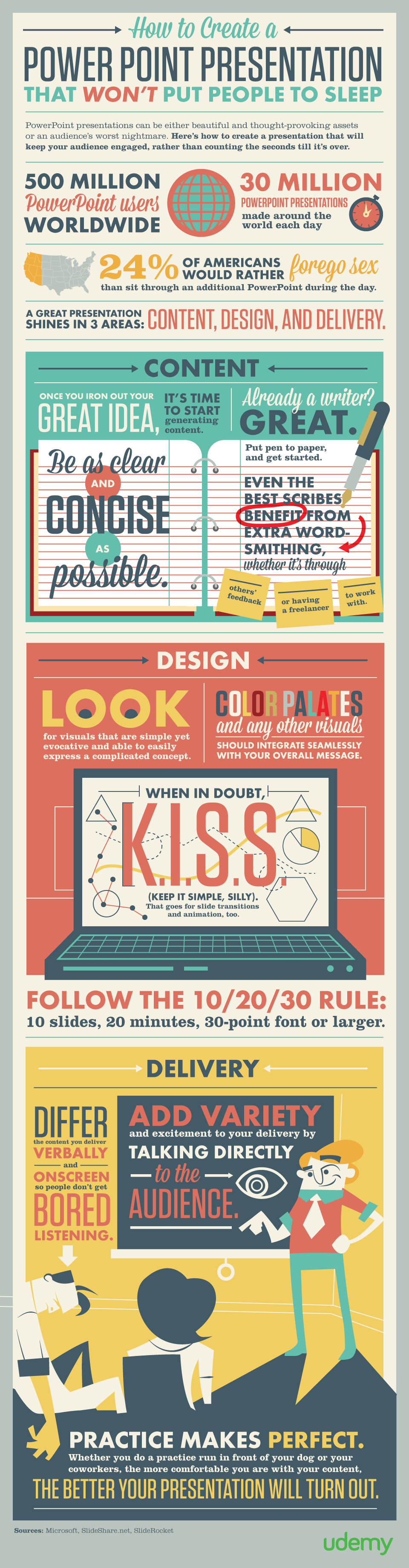
Let’s look at the below infographic on how to create a PowerPoint presentation, published by Udemy. The goal here is to tell people how to create an effective PowerPoint presentation.
First, we can forgo the first few facts on how many people use PowerPoint and how people don’t like to listen to people using a PowerPoint. We can chalk that up to not having to tell people what they already know. In fact, they are reading this because they know that and want to change it.
Here is what I see the infographic saying:
- Stellar PowerPoint presentations have great content, design, and delivery.
- Content. Be as clear as possible in what you are saying. Even if you are a great writer, you can benefit from another set of eyes, such as a colleague or a professional writer.
- Design. Keep it simple. Look for visuals that are simple yet can express a complex subject and use colors that flow easily with your overall message.
- Delivery. Use the 10/20/30 rule – no more than 10 slides, no more than 20 minutes, and no smaller than 30 point fonts. Differ what you say and what is on your slide, and talk directly to your audience, don’t just read your slides.
- Practice.
Ask yourself – can a reader more easily digest these 5 quick and clear bullets or the below infographic? Does the wide variety of fonts, colors, and sizes help or hinder comprehension? Do they follow their own advice to be clear and simple?
Sometimes infographics can be helpful, but you shouldn’t assume that graphics, arrows, and pretty fonts make it easier to understand, even for visual people like myself. Remember, good design is useful.
You might also enjoy my post, PowerPoint Must Die.